TYPESETTING
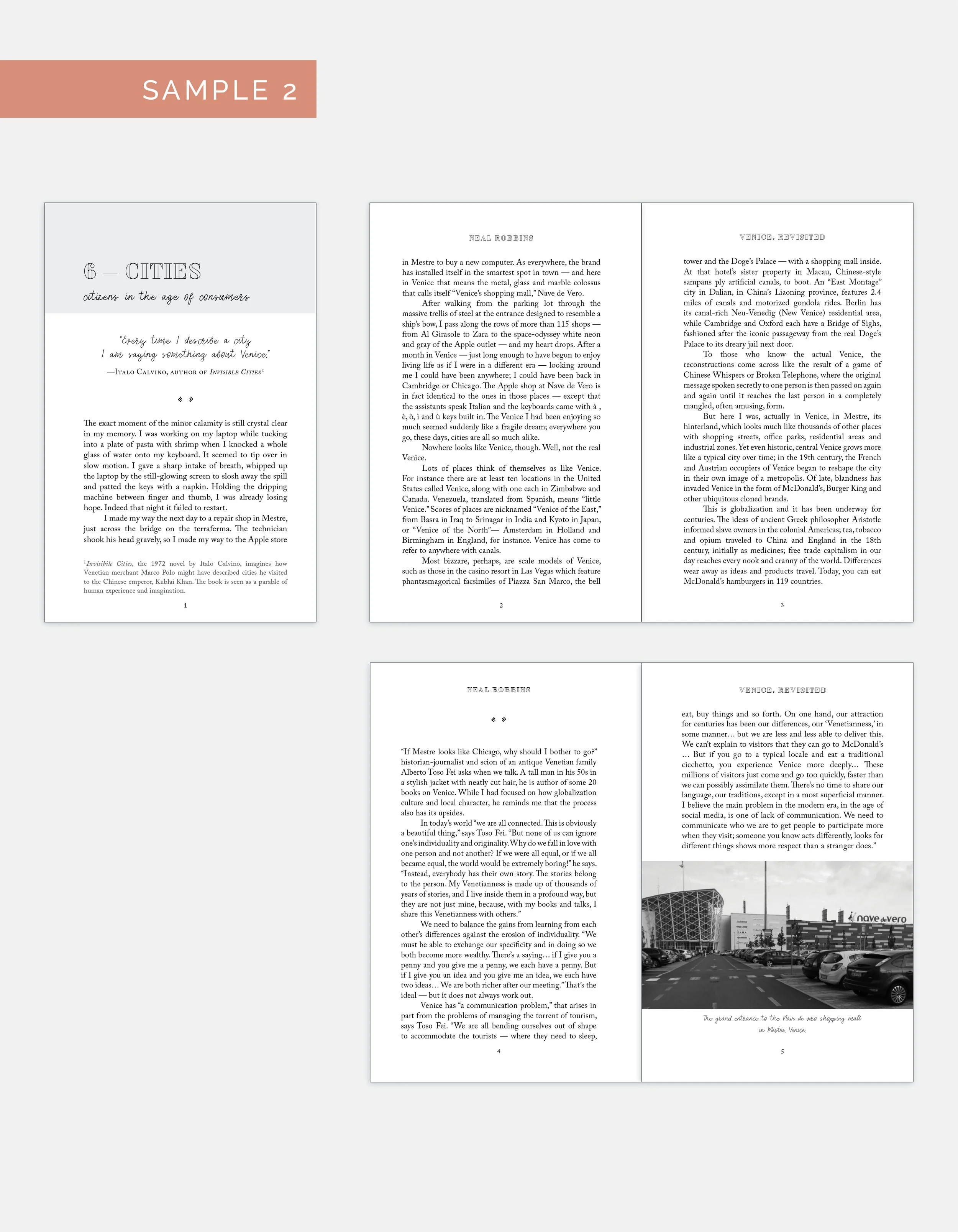
Of course, book design is not just about the cover. A beautifully designed interior will make your book a pleasure to read and to hold, because a physical book isn't just a medium for your writing, it's a piece of art in itself. And everything from the typeface to the margin settings should help tell the story. The right chapter headings set the mood, the appropriate spacing on a page allows your reader to breathe, the right glyphs add character to your pauses.
I offer three different interior samples before we begin with the full layout. This allows us to explore a variety of styles so we can ensure the design we move forward with completely supports your story.
You don’t need to remember what kerning (space between the letters) or leading (space between the lines) is, I’ll guide you through the process from sample designs through to proofreading the layout and on to your print-ready files.
Let’s take your book from manuscript to masterpiece!


